Mapping a Residency by Color @ Arteventura
MARCH 2026
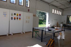
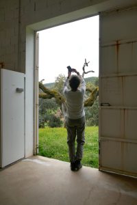
Last March, I spent four weeks in the Aracena area, in Andalusia, where I was an artist-in-residence at Arteventura. This residency not only gave me the time and space to work, but also to slow down. From this stance of slow watching, I worked on a personal and poetic color dictionary—an atlas built around three central themes: soil, sky, and nature.
For quite some time, I have been exploring how a color dictionary can be anchored in a specific place. This project is closely connected to my own way of observing and collecting: a slow, attentive process in which color, light, and time converge. It raises questions about how we experience landscapes within a technology-driven society, where images are constantly captured and shared. At the same time, I seek ways to make the essence of a landscape tangible—an essence that cannot be immediately captured, but emerges in the space between the real and the abstract, the analog and the digital.
SOIL
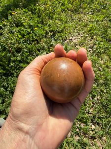
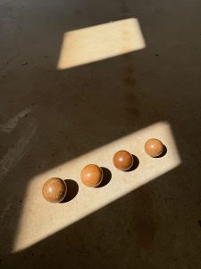
As part of this atlas, I created four Hikaru Dorodango—one for each week.
This Japanese technique involves shaping soil, clay, and water into polished spheres through a process of careful kneading, drying, and refining. By working with the clay and soil from the finca, each sphere took on its own character, in which subtle variations of the landscape become visible and tangible.
A tangible translation of the place itself.
SKY
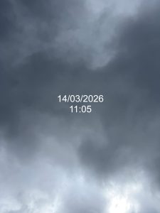
Since the pandemic, I’ve occasionally taken photos of the sky: I point my phone straight up, wherever I happen to be at that moment, capturing a fleeting instant as a small time capsule of that place.
Within Mapping a Residency, I explored this approach further. During my stay, I took a photo of the sky every day, each time combining it with a painted color impression of that same moment. This resulted in a sky-color calendar: a rhythmic, almost meditative whole, serving as a personal interpretation of the landscape in which I lived and worked for a month.
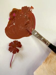
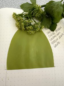
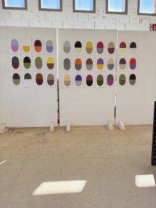
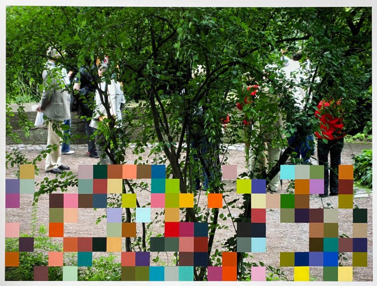
NATURE
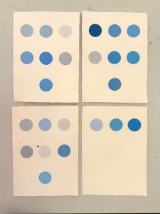
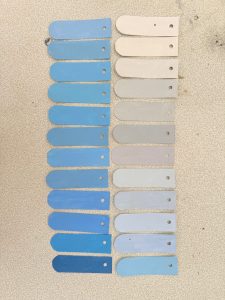
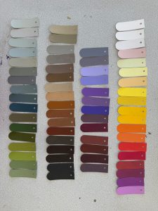
66 different colors brought together in 33 color capsules— all sourced from the immediate vicinity of Arteventura.
Nestled in the lush hills of the Sierra de Aracena y Picos de Aroche, the landscape is a vibrant green in March. Characterized by chestnut trees and evergreen cork and holm oaks, it is blanketed during this time by a carpet of tiny flowers.
I have translated these colors into my color capsules. Thus, the palette reflects not only what is visible, but also how I experienced the landscape. Each capsule therefore forms a personal impression of this place, in which color serves as a carrier of memory and presence.
I am grateful to have been able to work during this intensive period in this beautiful and quiet place, and I am very pleased with the result. This process encourages me to continue exploring, observing, and interpreting. In the coming period, I will be working on processing all the information I have gathered in this atlas.
To be continued….
Thanks:
![]()